Listen, whippersnappers. I was online back when one searched with Archie instead of Google. I remember when a text-based menu system called gopher was hailed as a startling breakthrough, which it was, since at the time they hadn’t invented the worldwide web yet.
Sadly, I never had a gopher. I did have an early webpage, however. It launched no later than March 1995, to judge by mentions of it that I find in old emails. I wrote it myself. All of it. That is, I wrote not only the words but the html. In those days the internet was very do-it-yourself. Because the site was hosted by Columbia, where I was in grad school, the URL was http://www.columbia.edu/~wcc6. It was a fairly nerdy thing; I don’t remember that any of my fellow grad students in English and American literature had one.
The earliest record that I have of what it looked like is dated 1999, four years after its birth, when I downloaded a copy before Columbia shut it down (I was, finally, graduating). By then it was looking a bit plain, compared to other websites on the internet, and I had begun to get emails from strangers asking why I didn’t update it more often. It was a point of pride with me, however, that a reader who browsed my website in Lynx, which only downloaded text, wouldn’t miss much. (Lynx was handy for bandwidth-poor people like me who connected via dial-up modem.) In other words, my public online self in 1999 probably wasn’t markedly different from my public online self in 1995. Here it is:
That was my dog. Yes, there were poems. No, I will not be re-posting the poems today. This isn’t quite what the website looked like, of course, because in those days the font of a website was chosen by its reader not its writer. My webpage would have appeared to you in whatever font you had told your browser you preferred.
After Columbia kicked me out of the nest, I vanished from the internet until March 2003, when I learned that as a Harvard alum, I qualified for a free blog, courtesy of the Berkman Center (now known as the Berkman Klein Center). The idea seemed to be that blogs were going to bring the Habermasian public sphere to the internet, and a nonprofit could reputably be in the business of inducing them to proliferate. The software platform was something called Manila. There were colors! There were templates! My URL was http://blogs.law.harvard.edu/calebcrain/, which gave a number of people the wrong idea that I was a law professor. Here’s a screenshot from December 2003, preserved thanks to the Wayback Machine.
My blog wasn’t named “Steamboats Are Ruining Everything” at first. That title was in place at least by October 2004, however, and in April 2006, I hooked it up to the URL https://steamthing.com, a portmanteau of the first and last syllables.
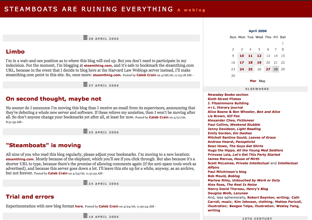
As you can see below, I switched to a red palette by April 2006, I think because I read somewhere that although people are soothed by tones of blue and green, they are more likely to find a brash color like red memorable. (Even back then we on the internet were trying to manipulate you.) Note the long, name-droppy blogroll in the right-hand column. Before Facebook (born February 2004) and Twitter (born March 2006), such links were how one found cool things to read on the internet (things you didn’t know you wanted to read, as opposed to things you knew you wanted to read, which you could search for).
The snapshot above is saved on my hard drive because I was then about to move to a blogging platform called Type Pad, and fearful of disaster, I made one of my rare backups. My probably erroneous memory is that Type Pad had struck some kind of deal with the Berkman Center to take bloggers off their hands; at that point no one any longer thought bloggers needed foundations or anyone else to encourage them.
In this era, on many blogs, one found at the end of a post little pellets of html frass, which offered to automate a connection, should the reader be generous enough to want to make one, to sites such as Reddit, Stumble Upon, and dozens of others. Let us clutter your website, these services proposed, and in exchange we will send you “traffic.” I briefly experimented and found that I hated the clutter, as well as the sense of having compromised myself, and thenceforward abstained. (I never tried ads or a tip jar.)
The Type Pad platform allowed for something called banners at the top of the page. Armed with a scanner, an old book of engravings of steamboat disasters, and a copy of Photoshop that I had purloined from Lingua Franca back in 2000, here’s what I came up with:
As you can see, by July 2009 I had backed off from all red. That color was now reserved for unclicked links. I developed a whole psychology of link colors, to mess with readers. Unclicked links were red, as if they were forbidden and butch, in order to dare you to approach. When you hovered your mouse over the link, however, it subsided to pink—friendly and nonthreatening and maybe even a wee bit submissive. If you fell for this, you would find, upon returning to the page, that the link had turned orange, as if you had created some kind of hazard. More manipulation on my part. I have kept these psychoerotic link colors to the present day. My background color in 2009 was a sort of sepia because the overall idea being conveyed was that I was a 19th-century guy; cf. the long list of 19th-century archival resources in the right-hand sidebar and the general look of intense textiness.
Here’s a slight improvement of the banner, captured in April 2010.
After a while, the pseudo-Victorian look began to seem a little somber to me. To lighten it up, I had the idea of making the title appear as if it were being uttered by one of the drowning steamboat passengers. As preserved by Archive.is, here’s a screenshot of February 2013:
In some ways I think this was the most echt Steamboats look, though I now regret having allowed the intrusion of a whole box of Twitter in the right-hand sidebar—a false compromise with a power that was then beginning to exterminate blogs right and left. Note that my lists of friends and 19th-century sources had by now been demoted. They were still on the page, but you had to scroll fairly far down to see them.
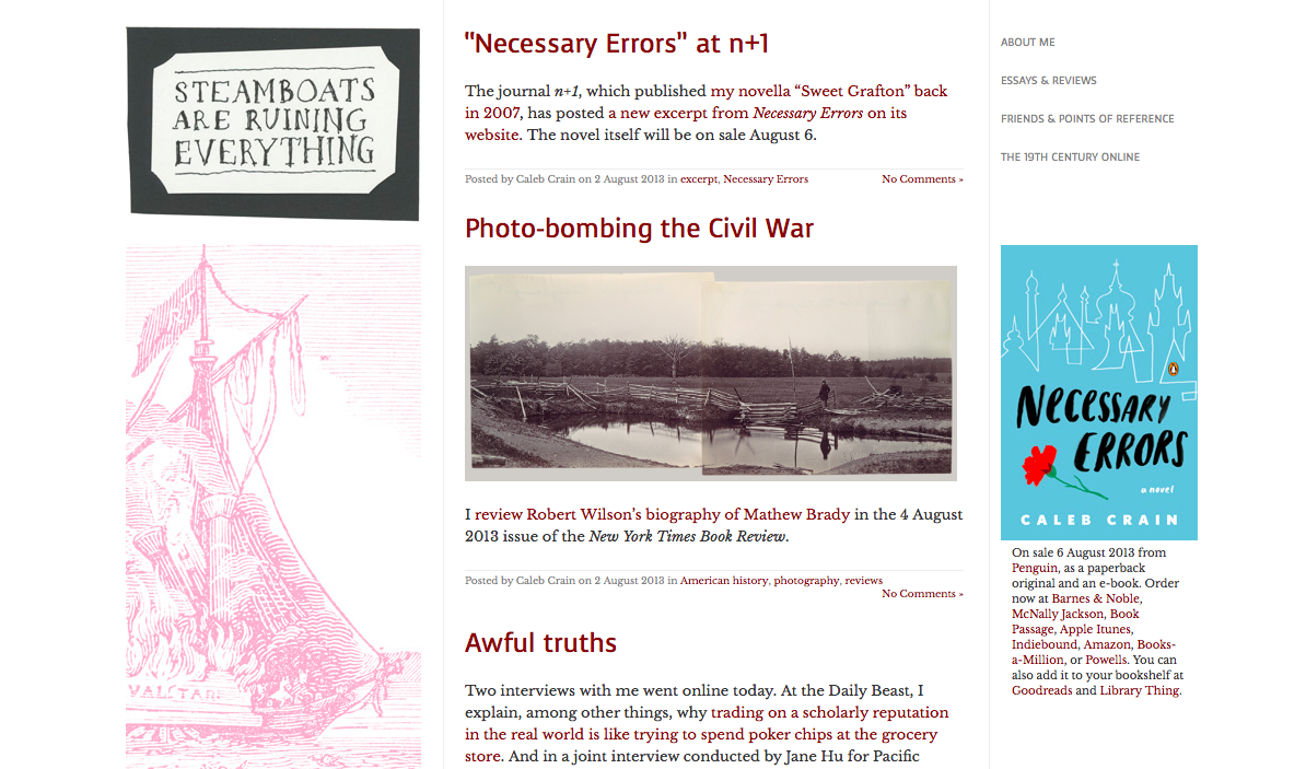
By 2013, I wasn’t really a 19th-century guy any more, except at heart, and my first novel was scheduled to come out in August. I needed a whole new look, fresh and modern. Type Pad, meanwhile, had become a little creaky in the joints, so I made a ridiculously kludgy switch to Word Press. I looked around and discovered that nobody but me still had a blogroll (and that most of my friends had shuttered their blogs), so the blogroll and the list of 19th-century resources were moved to subsidiary pages. The focus, I decided, would be on a single, readably narrow column of text, with recessive decoration on one side and a few unobtrusive utilities on the other. The advice about keeping the column of text narrow came from a website written by Kibo, ages ago. (Oh, you don’t know who Kibo is? How recently did you say you were born?) The idea of reducing distractions on the page to a minimum came from Mandy Brown’s blog, A Working Library. Here’s the end result of this redesign, as it appeared in August 2013, on the eve of the publication of Necessary Errors:
Elegant, no? Alas, it was hacked, in 2016, by people who seemed to be interested in porn and Indonesian song lyrics. While rebuilding and “hardening” the site, I took the opportunity to make it “responsive,” which is the word for a site that changes shape depending on whether you’re looking at it on a desktop computer or a mobile phone. (If you’re reading this on a laptop, you can see how this site now “responds” if you drag the lower righthand corner of your web browser to the left, to make it smaller; sometimes I do this myself just for the pleasure of watching the sidebars pop away into the ether, one by one.) I think the overall site lost a bit of its panache in the process, but utility is all and I like that the page is still relatively simple.
I seem to have left out of this post a history of comments, and also an explanation of why blogging is dead, but maybe those go without saying.


